Tassal Consumer Website Re Design


Tassal Consumer Website Re Design
Brief
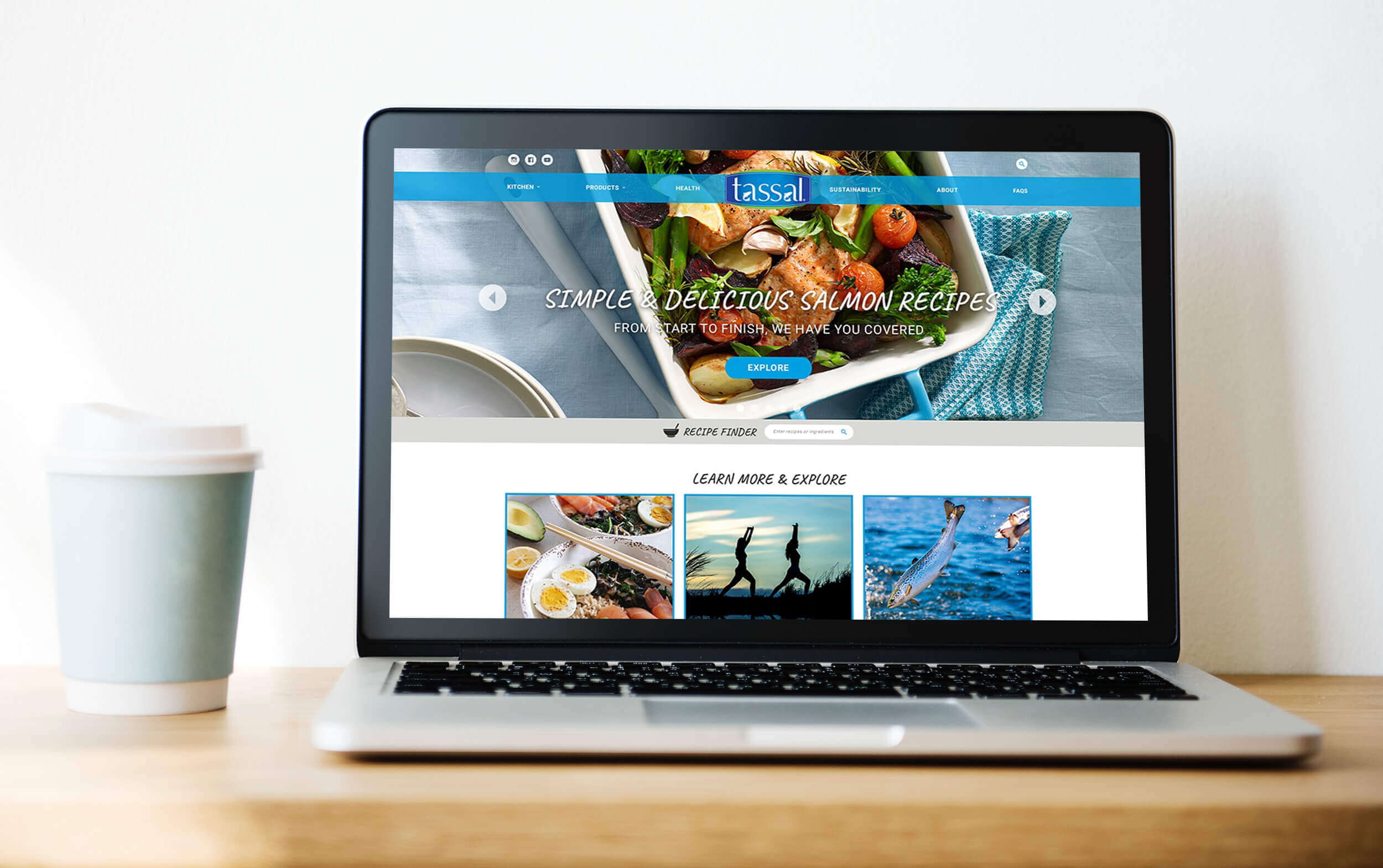
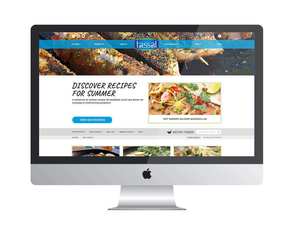
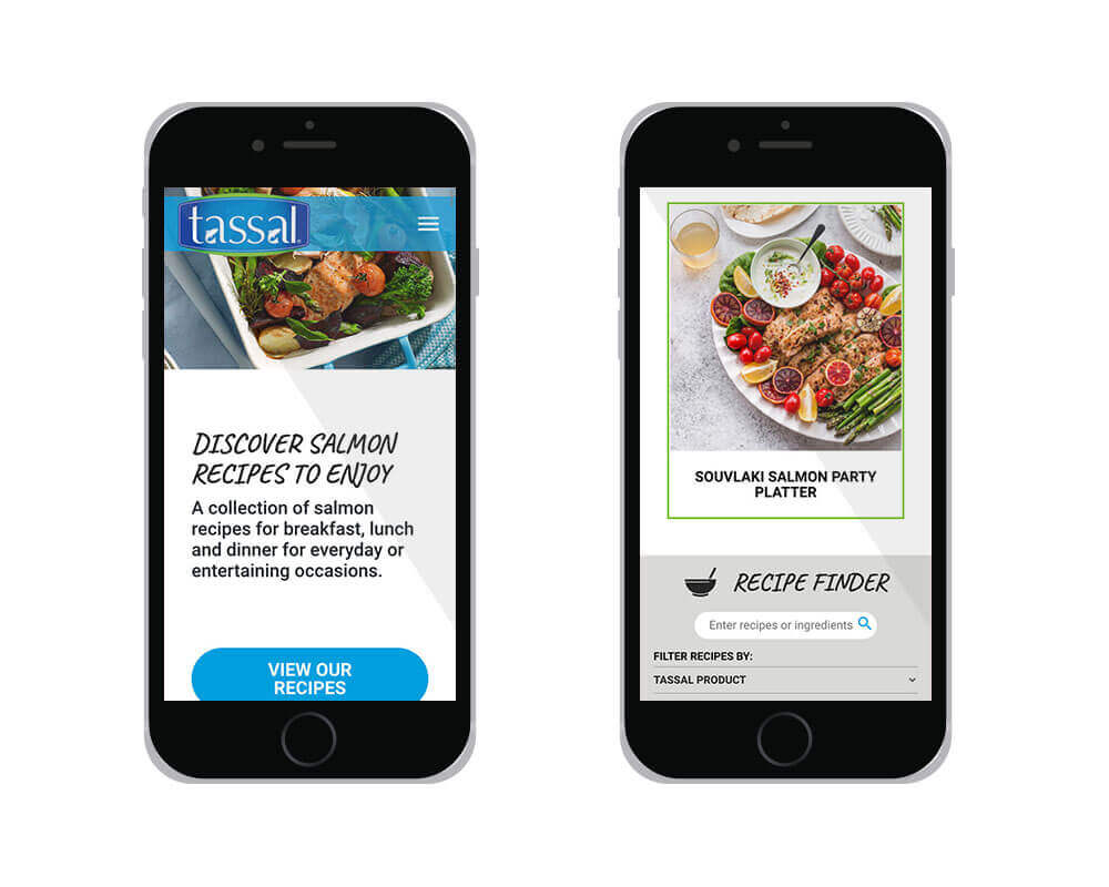
The consumer and corporate content for Tassal was originally housed in one website. The brief for this project was to separate the content into two sites to be able to focus the design for the different audiences. There was also a need to modernise the design and bring a focus to the recipes Tassal offer on their website.
Solution
The solution started with our strategist developing a user flow for the website before creating low fidelity wire frames to define placements of improved navigation recipes and products.
Once these user flows and wire frames had been defined we started on the high fidelity wire frames while working with developers to ensure designs could be implemented to the pixel. Once the structure of the website had been designed and signed off, our developers started on the development of the site while we then worked to deliver the rest of the design in stages.
Role
Visual Design, User Interface Design, UI Patterns & Style Guides
View Website