ReadyRooms Website Re Design


ReadyRooms Website Re Design
Brief
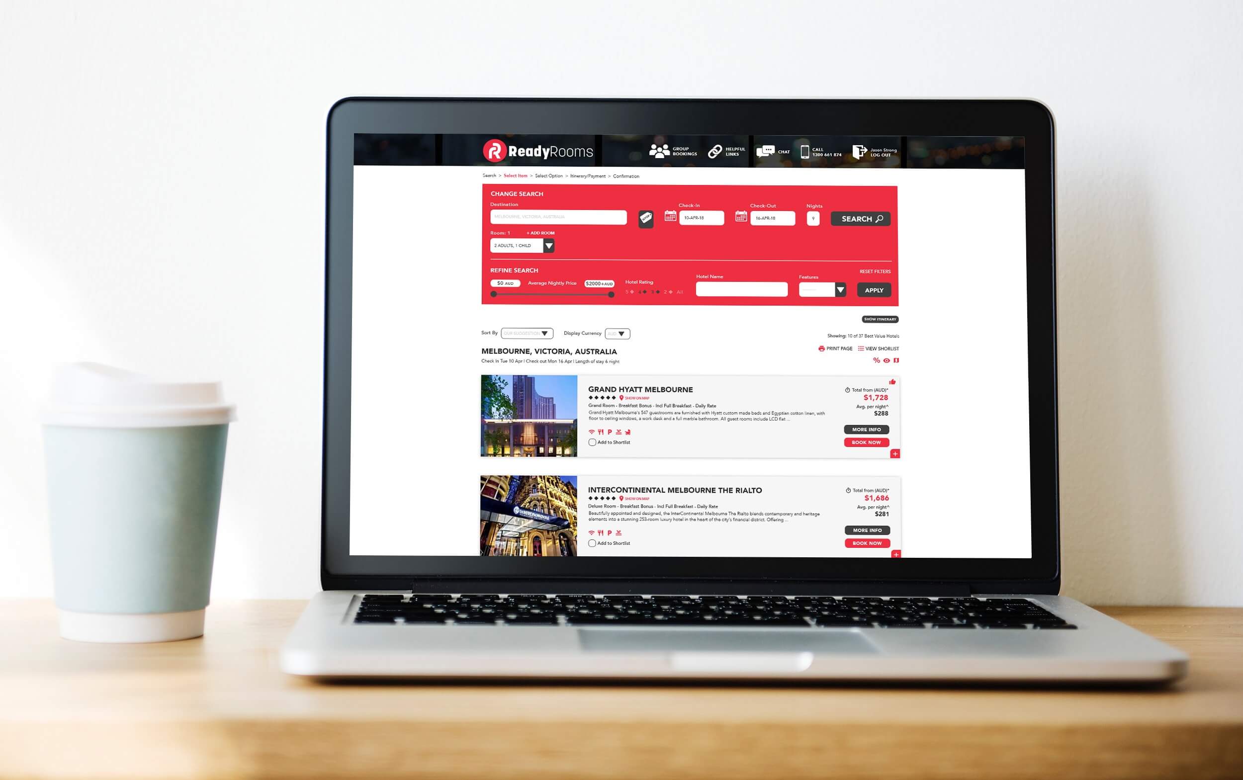
A complete re design of ReadyRooms was needed as the user interface and booking flow of the website need to be improved. The focus was on the improvement of the usability of the site to help travel agents move around the website with more ease.
Solution
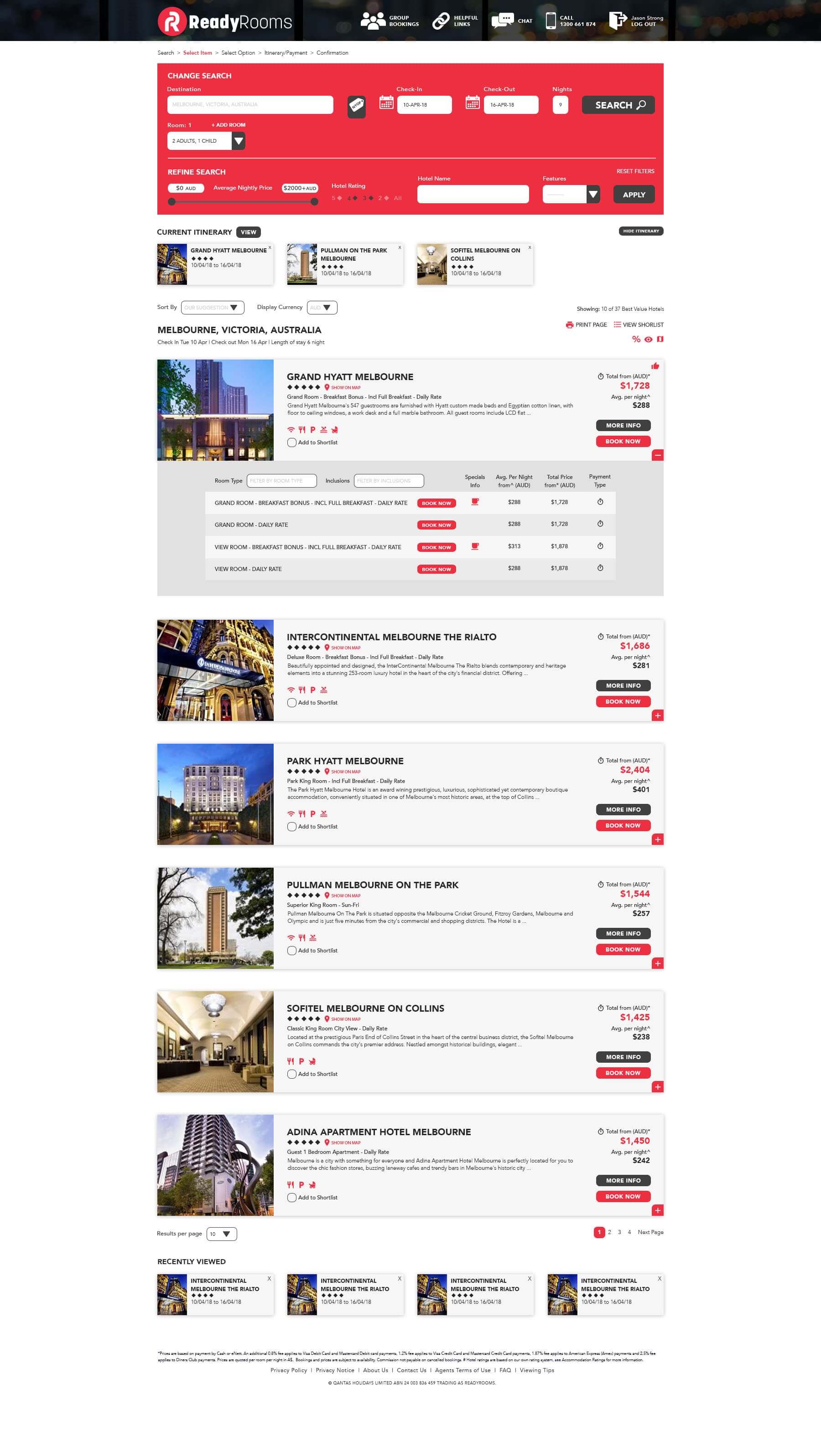
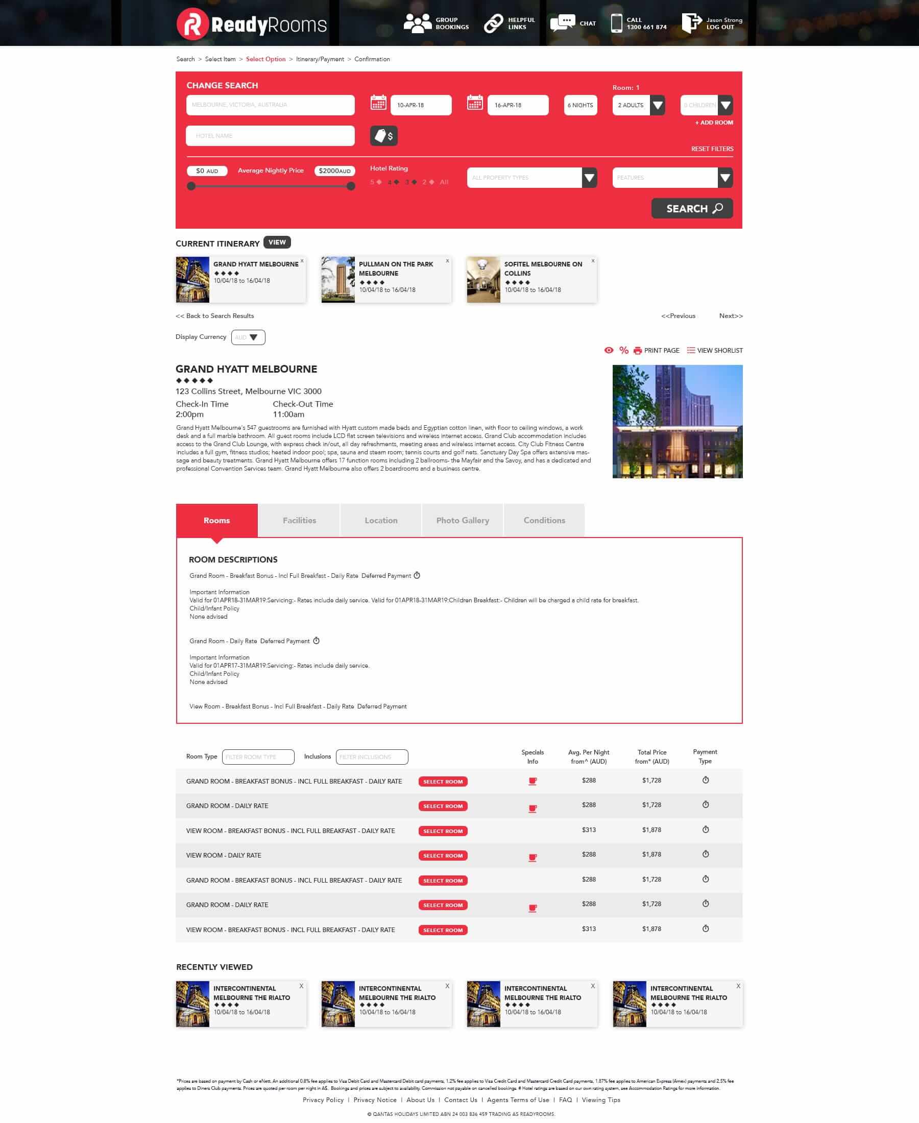
Working with business analysts, project managers and stakeholders, we begun with identifying the problems with the design and development of the site and which areas need to be improved the most. Business stakeholders and a selection of users were then presented with multiple high fidelity wire frame options before deciding on direction and designing the rest of the site. This included re designing the structure of the website, search functions, booking flows, payment pages and UI elements such as buttons and input fields.
As we had designed the structure of the website, the back end developers started on the re build of the site. We then worked in an agile environment to deliver certain sections of the site, both functionality and design wise. Once the site was in it's final stages we released a beta site to deliver to a certain group of users to test the site and give feed back on what could be improved.
Role
Visual Design, User Interface Design, UI Patterns & Style Guides, updating of tasks in Jira
View Website