Myki Online Top Up Design for Mobile


Myki Online Top Up Design for Mobile
Problem
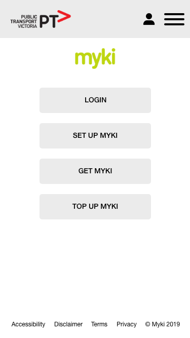
With the Public Transport Victoria website having recently been re designed, the Myki top up website still needs a lot of work. The User Experience & User Interface of the website greatly needs to be improved. The biggest pain point of the site is the difficulty of topping up online on anything other than a computer. In the era where more and more consumers and commuters are accessing websites on their mobiles and tablets rather than a computer there is a great need for these people to be able to top up while on the move or using their mobile phones.
Solution
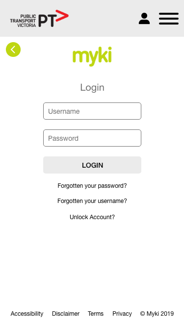
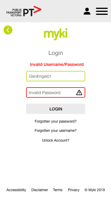
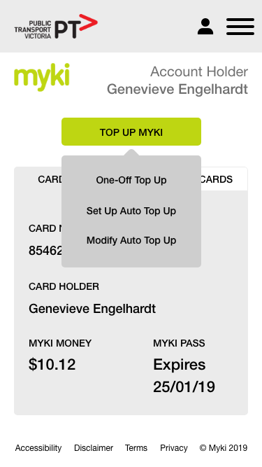
In this on going project, I've started with re designing the site for mobile, and then focusing on tablet and desktop which both still need work. I started with creating a basic site map to understand the content of the website and improve the hierarchy. From here I've created wire frames before starting on the Visual Design and User Interface of the website.
Once these had been determined, I started on the basic template designs, and when these had been completed and signed off, we designed the rest of the site, whilst working in an agile manner alongside the developers and researchers to refine the User Interface and Visuals to improve the usability and retention of the website. Now the website has been launched, we'll share the website with the wider community for any further user testing and improvements.
Role
User Experience Design, Visual Design, User Interface Design, Wire Framing, Prototyping
Please note, this is a personal project, I have't been approached by PTV or Myki to re design this site. View Prototype